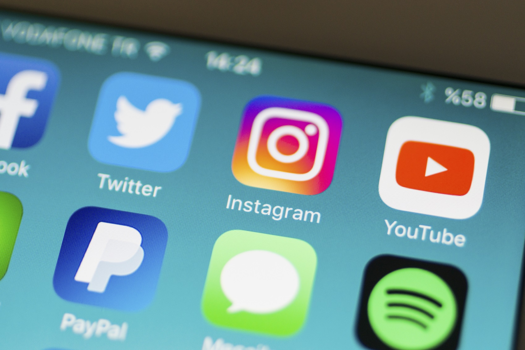
Earlier this month Instagram traded its classic brown camera logo – an icon recognized worldwide—for an updated sunburst design. While users, design professionals, and others in the industry had their fair share of opinions and mixed reviews, Instagram made a bold, and needed, change, embracing the dynamic social media landscape and evolving its branding accordingly.
The updated logo and, more importantly, the logic for doing so, was clearly communicated via Instagram’s blog, its Twitter, a Medium post by Instagram’s head of design Ian Spalter, and, obviously, an Instagram post. The social media platform that so many have come to love carefully weighed this decision and highlighted its process for arriving at the new brand look in a video—used across the various mediums mentioned above.
In addition, Spatler highlighted an important point in his Medium post, asserting that “brands, logos and products develop deep connections and associations with people, so you don’t just want to change them for the sake of novelty. But the Instagram icon and design was beginning to feel, well … not reflective of the community, and we thought we could make it better.”
I think it’s important to take a moment to reflect on other leading brands that have undergone similar logo refreshes. Nintendo, Starbucks, Apple, McDonalds, Google and Coca-Cola, to name a few, have all evolved their company branding. The Instagram team felt that the logo needed to reflect how vibrant and diverse the platform’s users and content has become, and this was a decision that was not simply arrived at overnight.
Beginning last year, the team thoughtfully determined which elements would be incorporated into its new look, asking Instagram employees to draw the old icon from memory in five seconds. The most recalled elements were the rainbow, lens, and viewfinder, which were fused into the new design. Instagram’s sister apps – Layout, Boomerang and Hyperlapse – also incorporated similar looks and feels in order to create uniformity within the suite. In addition, the app’s user interface was updated to a simple black and white layout that, according to Spatler’s blog, helps users’ photos and videos “shine.”
As an industry evolves and a company matures, changes are inevitable, particularly in the fast-paced social media landscape. Complacent companies are rarely successful, as new innovative ones will take their place. The successful companies are those that continue to reflect on strategy and adjust according to changes in the marketplace, and Instagram did just that.
While I’m not a huge fan of the updated logo, I am a proponent of and appreciate Instagram’s evolution. Further, the communications around Instagram’s new look and, more importantly, the thought process for doing so and how the new icon was arrived at, were well executed. Here’s to a new Instagram era!