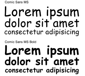
In a recent Wall Street Journal article, Emily Steel explores the world-wide movement to ban the Comic Sans font. This raises an interesting point about the importance choosing the right fonts in business.
Comic Sans has become synonymous with materials for kids and communicates a light-hearted, upbeat sentiment. Originally intended by its creator to mimic the font found in comic strip speech-bubbles, to some Comic Sans has become what the Ban Comic Sans movement describes as “the evil of typographical ignorance.”
While Comic Sans stirs up a decidedly less heated response for most readers in the context of grade school flyers, they would almost certainly be surprised to see it on a legal document. The same goes for its typographical cousins such as Lucida or Papyrus, both of which would seem markedly out of place on a business document.
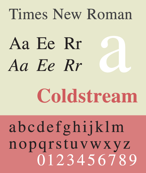
Since when did Times New Roman become the font du jour of the professional world? According to a Wikipedia article on the topic, the font was originally created and commissioned by the British newspaper, The Times, in 1931. Ever since it became commercially available in 1933, Times New Roman has become “one of the most successful and ubiquitous typefaces in history.”
Unlike Comic Sans, Times New Roman uses serifs and is therefore easier to read. Says Tim North, author of “Better Writing Skills,” the serif makes each letter more distinctive and easier for our brains to quickly recognize. Without the serif, “the brain has to spend longer identifying a letter because its shape is less distinct.”
At Communiqué PR, we use Times New Roman in nearly all written communication except e-mail, where Arial is our font of choice. E-mail seems to be the only place in business where experimentation is acceptable, with many people using different fonts and colors for their signatures.
Do you have a favorite font or thoughts on the Ban Comic Sans movement? We’d love to hear your opinion.